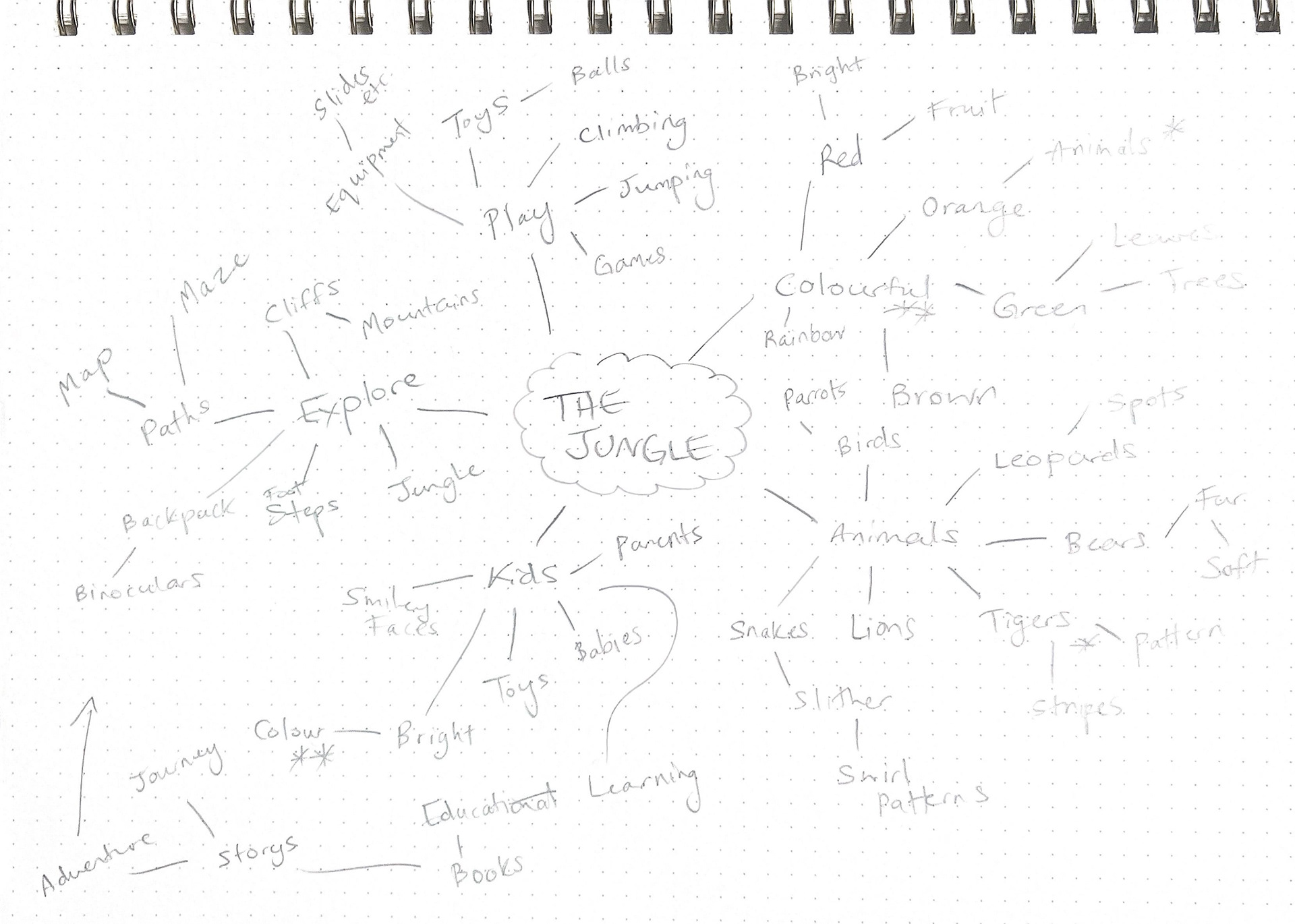
It helped me to expand my ideas past the first concepts that immediately came to mind and to think more creatively.
The next step was to do some market research looking at different logos within the industry, from real life companies and Pinterest inspiration, to see which ideas would work realistically for this company’s brand.
After I had done some research, I moved on to hand sketching some of the ideas that I got from the mind map:
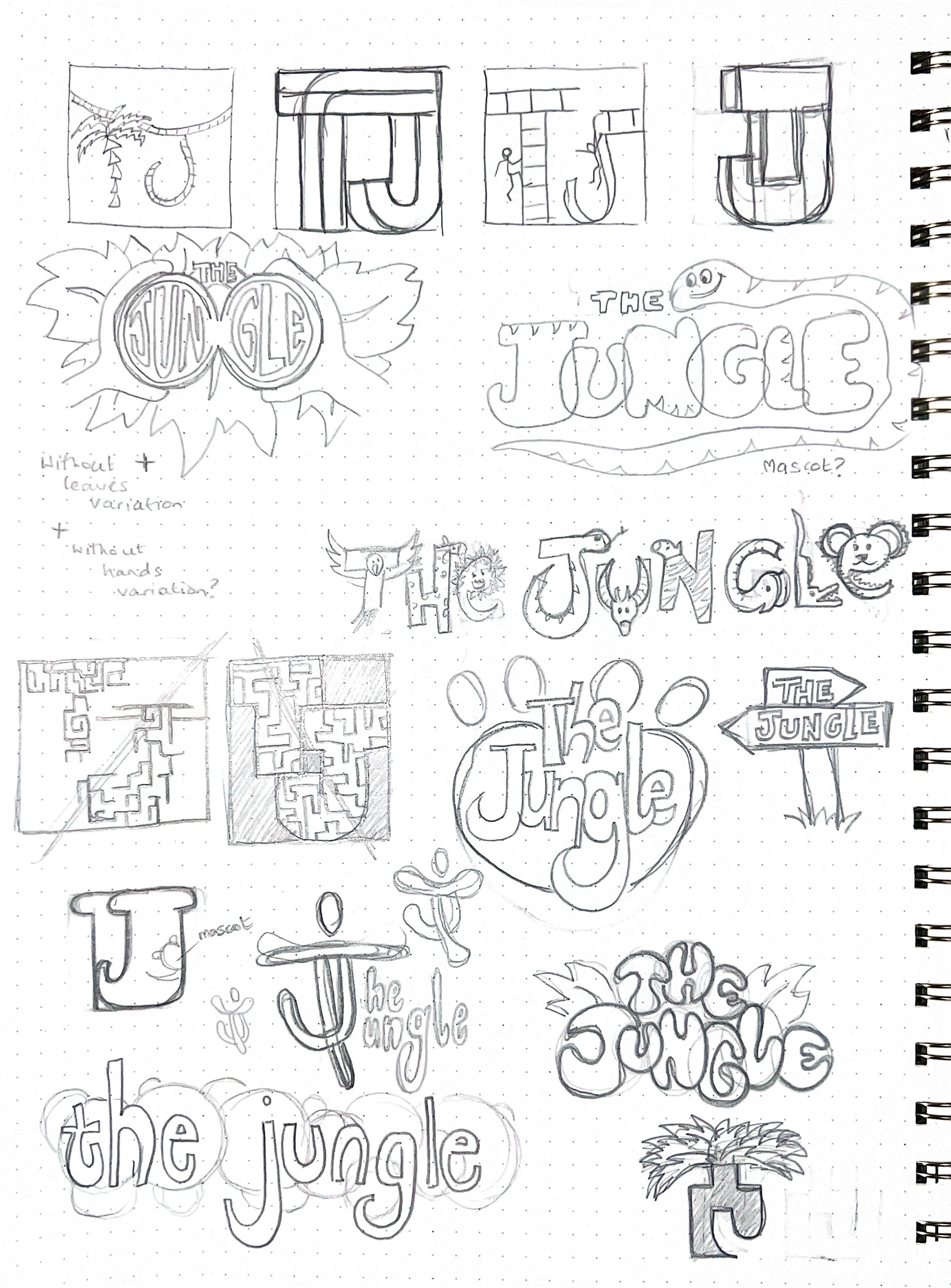
This also helped me widen my ideas that I had thought of through the mind map as I could see more clearly what would work better visually. Then I chose the sketched that I liked the best and started to use the tools we had been learning to create some rough digital sketches.
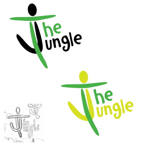


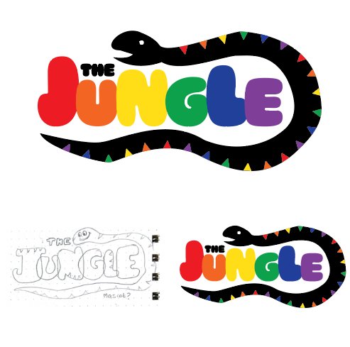
These three above were the ones that stuck out to me the most after the sketches were all completed as I felt they were most appropriate for the specific industry I was working within.
So, the next step in the process was to create a survey that i would send out to people who have experience in the industry of working with children, such as mothers of young children, teachers and even a couple of older children as well, to get a wide range of opinions.
I asked around 15 people in total and although it was close, the paw print design was the one that most people felt was appropriate for the brand. (Although the snake design,which came in second place was my personal favourite.)
So I worked on perfecting the paw print design and landed on this design.
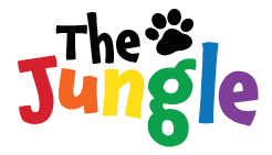
The original sketch was only the typography inside the paw print shape my mentor advised that the paw print wasn’t really necessary, but I felt that I still wanted to include it as an allude to the jungle/animal theme of the company name so I kept it as a small icon.
I used a font from Adobe as the base typography for the logo and created the paw icon using the pen tool in Illustrator and traced a generic paw print from Google Images.
I really liked the font I used - called ‘Chaloops’ - as it really reflects the playful, bouncy atmosphere of a children’s soft-play.
I also used the touch type tool in Illustrator to adjust the colours and kerning of the letters.
I was slightly concerned about having such a wide colour palette for the logo as it might affect the memorability for the brand but I felt it matched the direction and the industry that the brand was going for.
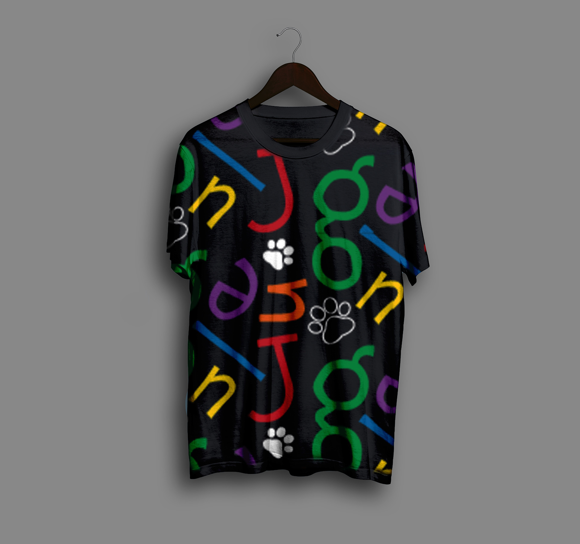
I then moved on the develop a brand pattern using the typography from the logo and an icon to be used for apps/websites etc.