Concept 1:
This concept merges the visual language of the Alps with the familiar shape of ice cream scoops. Mountain peaks are reimagined as layered scoops, creating a playful and instantly recognisable graphic that connects the Alpine name directly to the product.


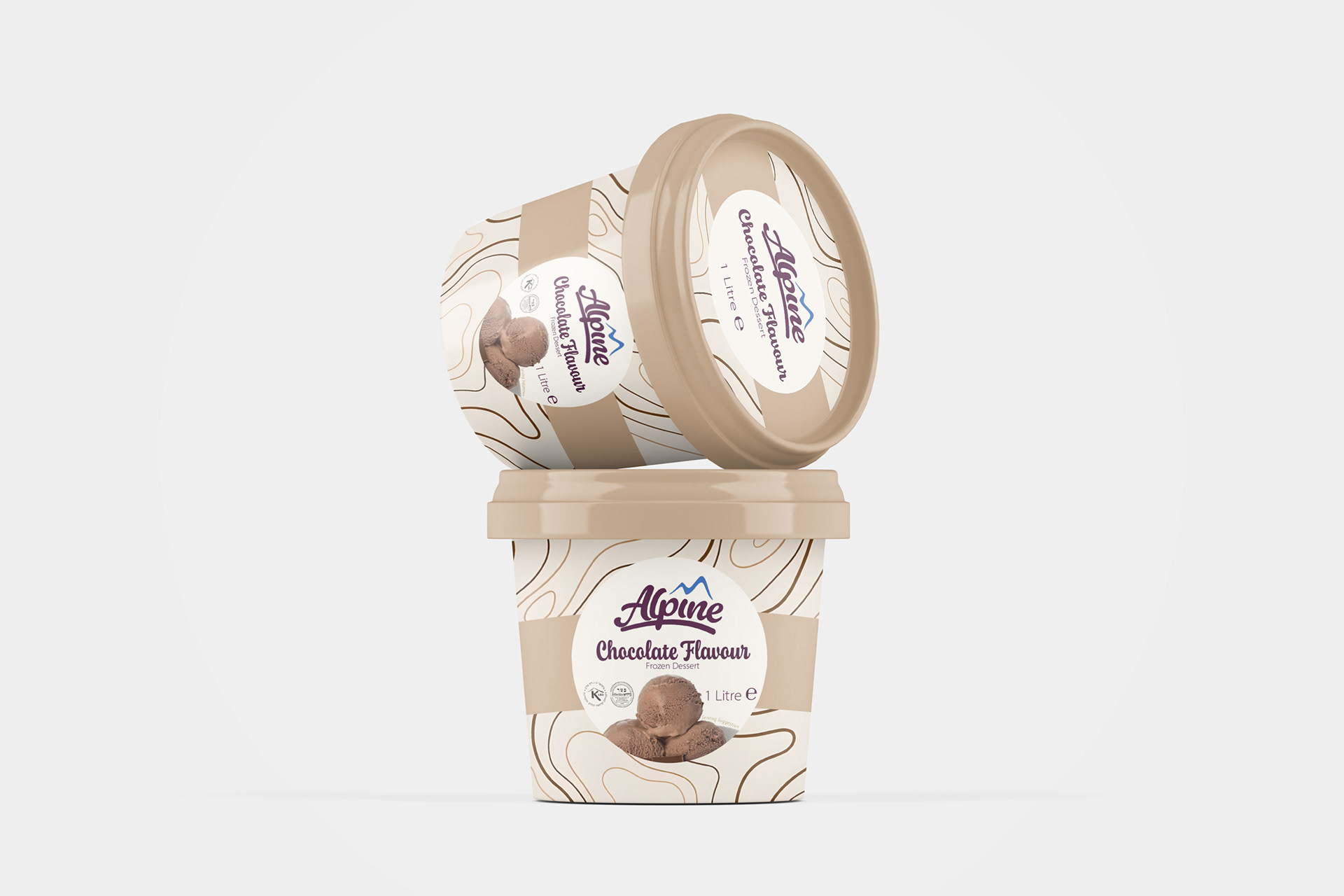
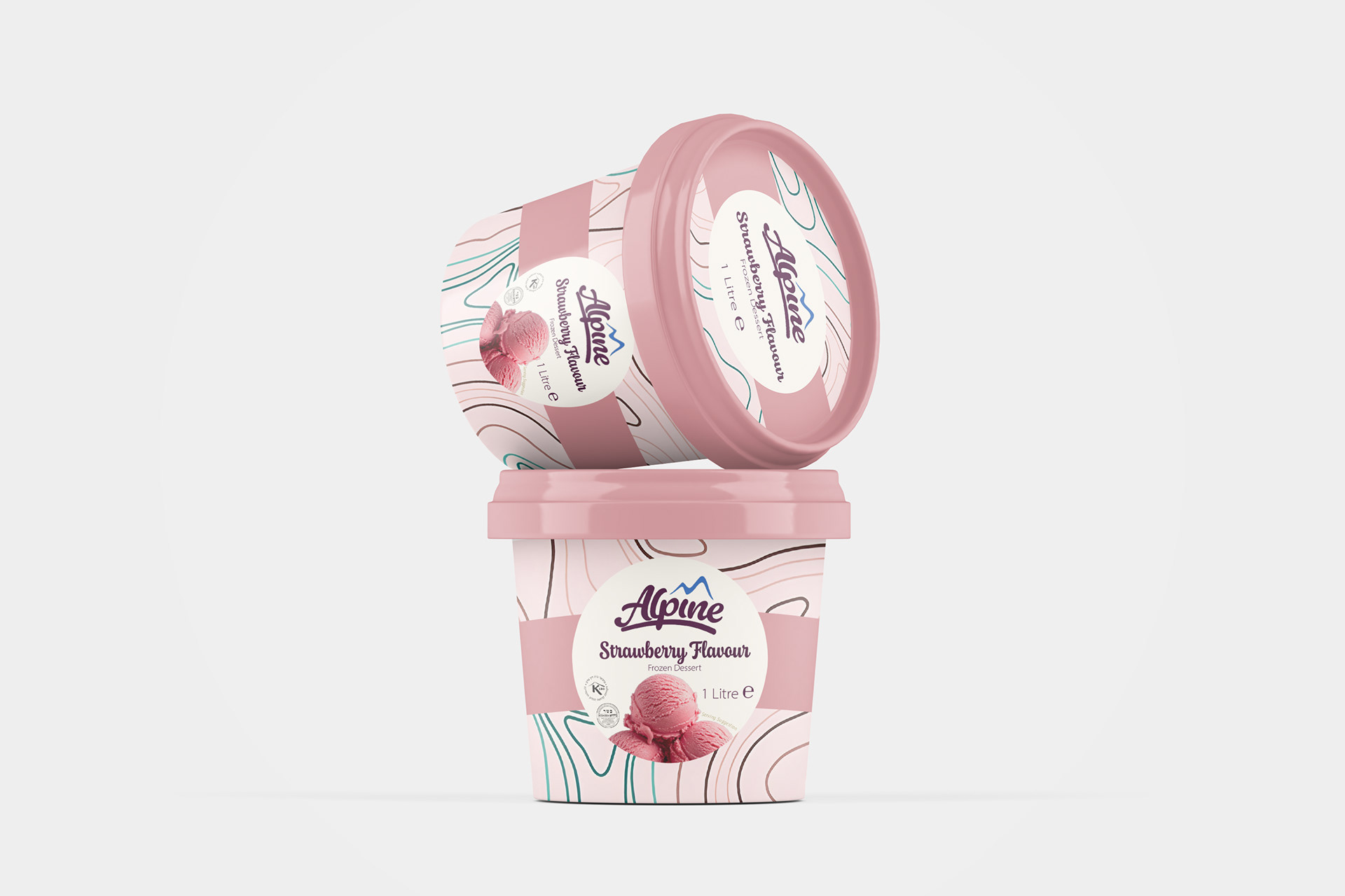
Concept 2:
Taking a more subtle approach, this concept draws inspiration from topographic maps, using flowing contour lines to reference Alpine landscapes. The lines are adapted to resemble the movement of ice cream drizzles, creating a visual connection between the mountains and dessert without being overly literal.